Patent Map
Contents
Outline of Patent Map
Patent map is constructed by patent information effectively organized, analyzed, and processed, and the patent information is represented by drawings, graphs, charts, or the like. The patent map is devised to enable us to easily reach the target information.
The patent map is roughly composed of the following two categories.
1. Statistics type (Data type)
Statistics-type patent map is prepared by statistically analyzing bibliographic items of patent information or the like, and is represented by graphs or the like. A large amount of 100 or more pieces of patent information are typically processed.
2. List type (Contents type)
List-type patent map is prepared by separately analyzing and organizing technical contents in patent information. A few dozen pieces of patent information are typically processed. In some cases, patent values are assessed by mainly evaluating the following four indexes, for example, using a data mining.
- Extraction of Essence of Inventions
- Variation of Claim Language
- Enablement Support (a degree of description of embodiments in a specification)
- Strength against Patent invalidation
The term "Data Mining" (discovering knowledge on the basis of stored data) refers to an approach or a series of processes for discovering/studying new knowledge, and the new knowledge can be obtained by storing/studying patterns or rules, which are derived from massive database, as a base of knowledge. In some list-type patent maps, data are classified into each component in a specific claim-set, and then, the patent value may be assessed.
Varieties of Statistics-type Patent Map
The statistics-type patent maps that we can prepare w ill be described. Hereinafter, a set of patent information collected by studying techniques, enterprises, or the like for a specific purpose is referred to as a "mother set".
Since the statistics-type patent maps are prepared on the basis of the mother set, ways of determining the mother set, the size of the mother set, or the like are naturally important. The statistic-type patent map includes 11 basic varieties: Ranking map; Share map; Time-series map; Matrix map; Correlation map; New-entry/Retire map; Portfolio map; Growth rate map; Unique data map; Comparative map; and Citation map.
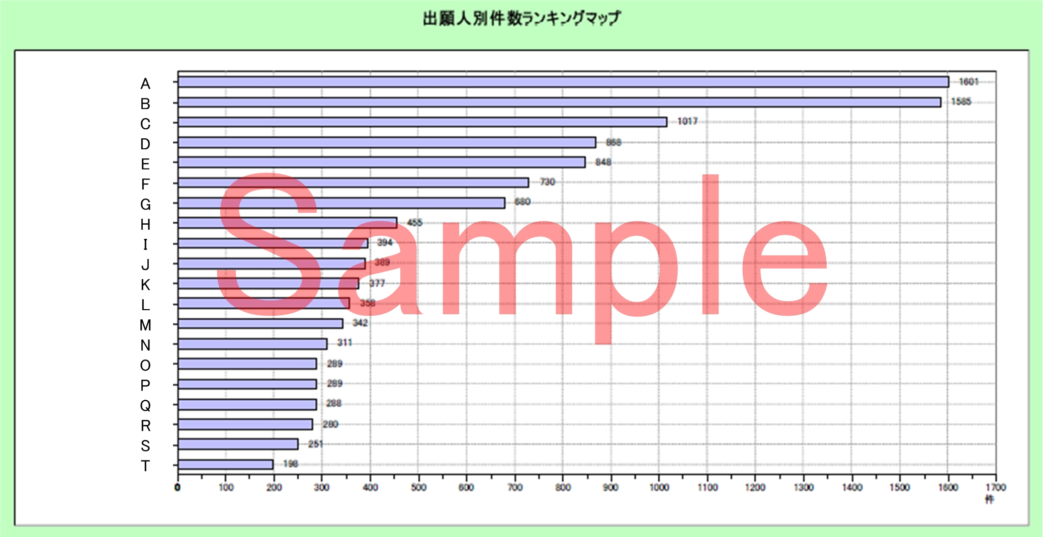
1. Raking map
In the ranking map, data are classified according to each viewpoint in patent information (classification code such as IPC, IF, and F-term, applicant, inventor, key words, etc.) included in the mother set, and each classified data is arranged in order of the higher or lower appearance frequency. Hereinafter, the data classified according to the above viewpoints is simply referred to as "data".
The ranking map allows us to grasp proportion of each data in the mother set, and more specifically, proportion of an applicant focusing on research and development (R&D) or the applicant's R&D (or unexplored) or strong (or weak) field can be studied. The ranking maps are largely represented by vertical or horizontal bar graphs or polygonal line graphs.
Figure 1. Ranking map
Purpose
- to study progress in technical development relating to some specific keywords in a ranking format;
- to study progress in technical development of each applicant in a ranking format;
- to study progress in technical development of each inventor in a ranking format;
- to study progress in technical development of each classification number;
- to study fields where a plurality of manufacturers are competing;
- to study fields where a plurality of engineers are competing;
- study applicants extending their business activities into a plurality of technical fields; and more.
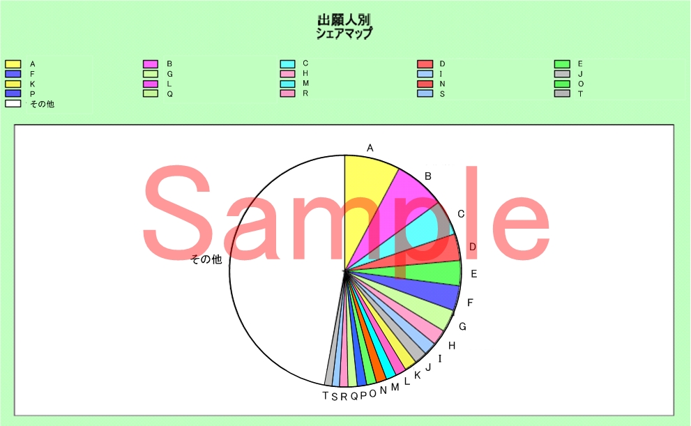
2. Share map
In the share map, proportion of each specific data included in the mother set is shown. The proportion of each data can be to the whole mother set or predetermined data in the mother set. The share map, just like the ranking map, allows us to grasp proportion of each data in the mother set and, addition to it, to compare data if data included in the mother set is divided into some groups.
The ranking map and share map do not usually show time-series changes, but the time-series changes can also be studied if the mother sets for several years are prepared. The share maps are largely represented by pie charts.
Figure 2. Share map
Purpose
- to study the occupancy of specific technology;
- to study dominant status in technical development for a specific classification or the like;
- to study the occupancy of a specific applicant;
- to study the occupancy of a specific inventor; and more.
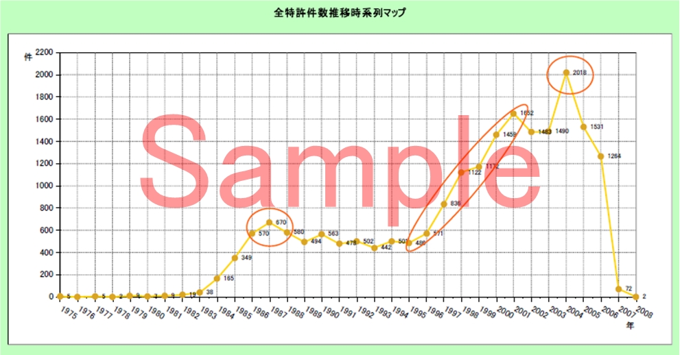
3. Time-series map
In the time-series map, data included in the mother set are time-sequentially shown. The time-series map allows us to grasp time-series changes (trends) of the data. The time-series maps are largely represented by polygonal line graphs, bubble charts, or radar charts.
In the bubble chart, time-series changes of each data can also be studied when proportion of each data in a circle is additionally shown as shown in the share map.
In the radar chart, balance in changes of data in comparison target items can be studied. The data of the comparison target item are plotted on axes of the chart, and the adjacent data are connected with lines, which form a star (grand total) or web (cumulative total) shape for each time-series. The radar chart allows us to grasp balance in progress of the comparison target items, more specifically, a development progress of a specific applicant in a specific field.
Figure 3. Time-series map
Purpose
- to study the development progress in technical fields;
- to study the trend of technical development of a specific applicant from each number of applications;
- to study the development progress of inventors;
- to study the trend of technical development of a specific inventor from the number of applications;
- to study the technical development progress of a specific category from each number of keywords;
- to study the technical development progress of a specific category from the number of inventors;
- to study the trend of technical development in a specific category from the number of applicants; and more.
4. Matrix map
In the matrix map, data in the mother set mainly belonging to two viewpoints (matrix) are arranged and classified. To prepare the matrix map, it is necessary to consider what is put into/set to squares (cells) of matrix and how it is put into/set to there.
For instance, it is important that viewpoints of keywords arranged in the matrix should be coordinated when the matrix map is prepared using keywords. The viewpoint of the keyword may be coordinated into either one of five options: Materials; Uses; Energy; Structure; and Time, which are used for TEMPEST analysis. Alternatively, the viewpoint of the keyword may be coordinated into either one option of: four kinds of issue-related viewpoints (Purpose, Product, Category, and Kinds); four kinds of solution-related viewpoints (Materials, Structure, Treatment, and Function); and four kinds of result-related viewpoints (Effect, Property, Uses, and Difference).
The matrix map allows us to grasp which squares in the matrix the data converge / scatter in, and more specifically, the trend of technical development in the mother set can be analyzed. The matrix maps are largely represented by bubble charts.
Figure 4. Matrix map

Purpose
- to study the correlation among technologies;
- to study the presence or absence of co-applicants and the number of applications with such co-applicants;
- to study the technology deployment and the technical scope of applicants;
- to study the circumstances of corporate entry into fields correlated with a specific field; and more.
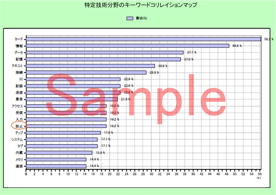
5. Correlation map
In the correlation map, data in the mother set belonging to two viewpoints, that is, main and sub viewpoints are arranged in order of the higher or lower correlation between the main and sub viewpoints. In particular, the correlation between the main and sub viewpoints is evaluated as a ratio of the sub viewpoint to the main viewpoint, and the data are arranged in order of the larger ratio. The correlation patent map is roughly composed of four kinds of maps: Category Correlation map; Applicant Correlation map; Inventor Correlation map; and Keyword Correlation map.
(a) Category Correlation map
It is for studying the relation between the first (main) invention information and the second (sub) invention information.
(b) Applicant Correlation map
It is for studying rankings of co-applicants.
(c) Applicant Correlation map
It is for studying rankings of co-inventors.
(d) Keyword Correlation map
It is for, after a certain (main) keyword is specified, studying the ranking of the other (sub) keywords, other than the main keyword, in the claims and the abstract.
The correlation map allows us to grasp important viewpoints for a specific viewpoint in the mother set. Studying this important viewpoints allows us to perform accurate investigation and analysis with minimized omission. The correlation maps are largely represented by vertical or horizontal bar graphs or polygonal line graphs.
Figure 5. Correlation map
Purpose
- to study relevance in the same idem (technology, applicant, and inventor); and more.
6. New-entry/Retire map
In the new-entry/retire map, the new-entry (emerging) and retire (disappearing) trends in specific technologies can be mainly studied focusing applicants, inventors, classifications, keyword, or the like. The new-entry/retire map allows us to grasp trends of changes in technical development. The new-entry/retire maps are largely represented by horizontal bar graphs or density graphs.
Figure 6. New-entry/Retire map
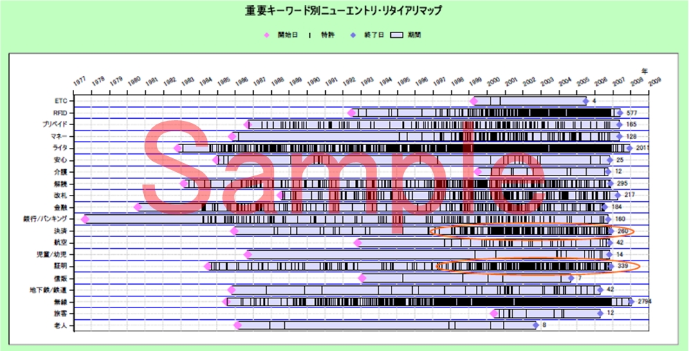
Purpose
- to detect newly emerging technical fields;
- to detect newly emerging engineers;
- to detect new or entry technology in specific categories;
- to detect obsolescent technical fields:
- to detect when specific applicants withdrew;
- to study the withdrawal status of inventors or the like; and more.
7. Portfolio map
In the portfolio map, technical life cycles (process of emergence, growth, development, maturity, and decline) can be mainly studied in the mother set. The portfolio map allows us to expect which point in the life cycle the progress status in the specific technical development is placed. The portfolio maps are largely represented by bubble charts.
Figure 7. Portfolio map
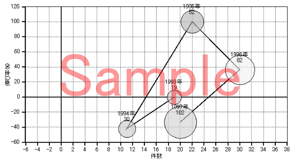
Purpose
- to study advances in technology using the life cycle, the growth rate, the composition ratio, the growth rate; and more.
8. Growth rate map
In the growth rate map, data for a specific period in the mother set are arranged in order of the greater or lower growth rate in the number of patent applications or the like. The growth rate map allows us to detect technology excellent in growth. The growth rate maps are largely represented by horizontal bar graphs.
Figure 8. Growth rate map
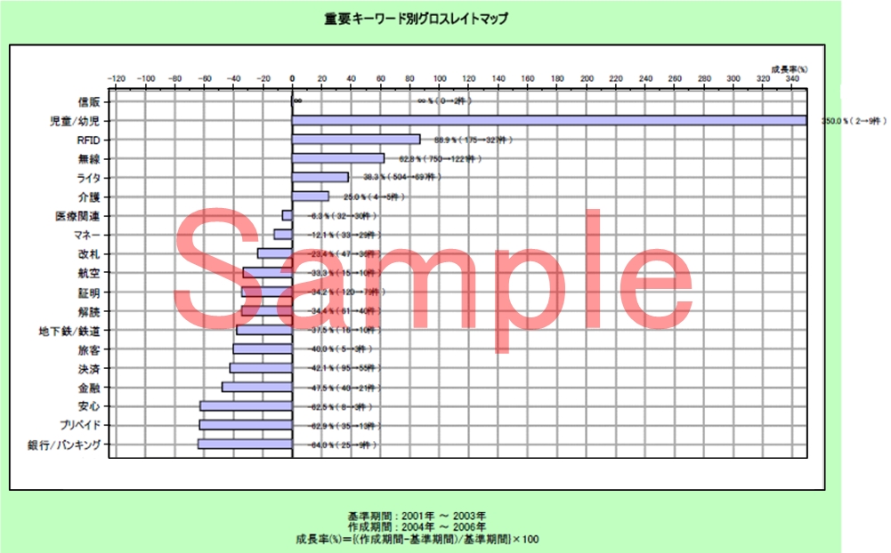
Purpose
- to detect applicants who have rapidly grown;
- to detect technology field being actively researched and developed;
- to detect engineers who actively continue with development; and more.
9. Unique data map
In the unique data map, unique data in the mother set, for example, keywords appearing only in a specific applicant are arranged in order of higher or lower appearance frequency. The unique data map allows us to detect technologies that only the specific applicants or inventors are working with. The unique data maps are largely represented by vertical or horizontal bar graphs or polygonal line graphs.
Figure 9. Unique data map
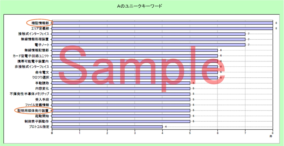
Purpose
- to study technologies (keywords, IPC, or the like) or unique expressions of specific targets; and more.
10. Comparative map
In the comparative map, specific two data in the mother set are shown compared. Specified items of the specific two data are shown on the longitudinal axis of a graph to compare the specific two data. The comparative map allows us to grasp the relative merits of technical matters or the like between specific applicants or inventors. The comparative maps are largely represented by vertical or horizontal bar graphs or polygonal line graphs.
Figure 10. Comparative map
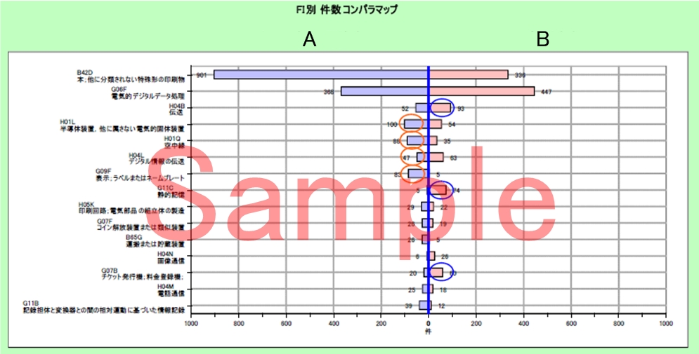
Purpose
- to study specific applicants, inventors, or the like by comparing their technologies or the like; and more.
11. Citation map
In the citation map, information connections among patent information and quote/quoted information are visualized. The citation map allows us to discover leading or important technology in specific fields. The citation maps are largely represented by patent charts.
Figure 11. Citation map
Purpose
- to discover connection among a plurality of patents by identifying the quote/quoted relation among the patents using references or citations in procedure records information; and more
Reference Materials
- The Intellectual Property Center of Osaka University, "Kikai 6 Shokyakuro gijutsu" of "Gijutsu-bunyabetsu Tokkyo map", the Japan Patent Office, Section "Patent map toha"; and
- Arai, Kimio. Patent-map no Zenchishiki, PATENTTECSHA, 2014.
※Please do not hesitate to contact us for any questions or details regarding patent maps.